


探索CSS的奇妙世界:多弧形加载动画的创建与实现
知识点:①熟悉 :before 、 :after 伪选择器的使用 ②熟悉 animation 动画属性 ③通过 border 来绘制双弧线
思路:先写出主体双弧线,然后通过 :before 和 :after 来添加新的双弧线,然后设置不同的 animation 属性来让双弧线动起来。
核心代码部分,简要说明了写法思路;完整代码在最后,可直接复制到本地运行。
核心代码
html 代码
<div class="loading42"></div>
div标签作为主体双弧线。
css 部分代码
.loading42{
  width:40px;
  height:40px;
  border:6px solid rgba(0,0,0,0);
  border-top-color: #b12a5b;
  border-bottom-color: #b12a5b;
  border-radius:50%;
  position: relative;
  animation: eff42 1.4s linear infinite;  /*设置主体动画参数*/
}
.loading42:after{
  content: '';
  width:60px;
  height:60px;
  border:6px solid rgba(0,0,0,0);
  border-top-color: #ff8177;
  border-bottom-color: #ff8177;
  border-radius:50%;
  position: absolute;
  top: -16px;
  left: -16px;
  animation: inherit;
  animation-duration: 0.7s;  /*设置动画持续时间*/
  animation-direction: reverse;  /*设置动画反向*/
}
.loading42:before{
  content: '';
  width:20px;
  height:20px;
  border:6px solid rgba(0,0,0,0);
  border-top-color: #ff8177;
  border-bottom-color: #ff8177;
  border-radius:50%;
  position: absolute;
  top: 4px;
  left: 4px;
  animation: inherit;
  animation-duration: 0.7s;  /*设置动画持续时间*/
  animation-direction: reverse;  /*设置动画反向*/
}
@keyframes eff42{
  to{
    transform: rotate(360deg);
  }
}
页面中div 作为主体,通过 border 属性绘制出主体双弧线,并且给它设置 animation 动画属性相关参数,然后基于主体双弧线通过 :before 和 :after 新增两个新的双弧线,设置不同的宽度、高度以及边框颜色,通过定位让三个双弧线居中分布,然后给两个伪选择器 :before 和 :after 设置动画时长( animation-duration 属性 )以及动画反向( animation-direction 属性 )。
完整代码如下
html 页面
<!DOCTYPE html>
<html lang="zh">
    <head>
        <meta charset="utf-8">
        <link rel="stylesheet" href="style.css">
        <title>多弧形加载动画</title>
    </head>
    <body>
        <div class="app">
            <div class="loading42"></div>
        </div>
    </body>
</html>
css 样式
/** style.css **/
.app{
width: 100%;
height: 100vh;
background-color: #ffffff;
position: relative;
display: flex;
justify-content: center;
align-items: center;
}
.loading42{
width:40px;
height:40px;
border:6px solid rgba(0,0,0,0);
border-top-color: #b12a5b;
border-bottom-color: #b12a5b;
border-radius:50%;
position: relative;
animation: eff42 1.4s linear infinite;
}
.loading42:after{
content: '';
width:60px;
height:60px;
border:6px solid rgba(0,0,0,0);
border-top-color: #ff8177;
border-bottom-color: #ff8177;
border-radius:50%;
position: absolute;
top: -16px;
left: -16px;
animation: inherit;
animation-duration: 0.7s;
animation-direction: reverse;
}
.loading42:before{
content: '';
width:20px;
height:20px;
border:6px solid rgba(0,0,0,0);
border-top-color: #ff8177;
border-bottom-color: #ff8177;
border-radius:50%;
position: absolute;
top: 4px;
left: 4px;
animation: inherit;
animation-duration: 0.7s;
animation-direction: reverse;
}
@keyframes eff42{
to{
transform: rotate(360deg);
}
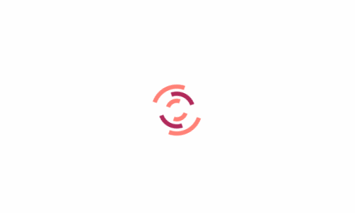
}页面渲染效果

以上就是所有代码,以及简单的思路,希望对你有一些帮助或者启发。
CSS
web前端
网站开发
阅读排行
-
1. 微信支付商户申请接入流程
微信支付,是微信向有出售物品/提供服务需求的商家提供推广销售、支付收款、经营分析的整套解决方案,包括多种支付方式,如JSAPI支付、小程序支付、APP支付H5支付等支付方式接入。
查看详情 -
2. 浙江省同区域公司地址变更详细流程
提前准备好所有需要的资料,包含:房屋租赁合同、房产证、营业执照正副本、代理人身份证正反面、承诺书(由于我们公司其中一区域已有注册另外一公司,所以必须需要承诺书)
查看详情 -
3. 阿里云域名ICP网络备案流程
根据《互联网信息服务管理办法》以及《非经营性互联网信息服务备案管理办法》,国家对非经营性互联网信息服务实行备案制度,对经营性互联网信息服务实行许可制度。
查看详情 -
4. 微信小程序申请注册流程
微信小程序注册流程与微信公众号较为相似,同时微信小程序支持通过已认证的微信公众号进行注册申请,无需进行单独认证即可使用,同一个已认证微信公众号可同时绑定注册多个小程序。
查看详情 -
5. Higress推出全新 WebAssembly (Wasm) 运行时,实现显著性能飞跃
Higress切换到WAMR运行时,Wasm插件性能显著增强Higress近日宣布,其Wasm插件的运行时已从V8成功切换到WebAssemblyMicroRuntime(WAMR),并在开启AOT(Ahead-Of-Time)编译模式后,实现了显著的性能提升。据测试数据显示,大部分插件的平均性能提升了约50%,而对于逻辑复杂的插件,其性能甚至实现了翻倍增长。
查看详情